Is there an easier way to measure ROI? Join us in the world of Databox and see how we use the tool to get a full overview of how much we earn from all our marketing efforts and how we can use the time to actually analyze the numbers rather than manually retrieve them.
Everyone who deals with marketing knows how important it is to be able to measure ROI (Return on Investment) on the activities they do. How else can you measure the success of all the hard work you lay down?
What is easy to understand in theory, however, can be more challenging to execute in practice. Fortunately, there are several great tools that can help you put your finger on exactly what gave you the 100 new leads or the increase in traffic to the website.
At Inbound Norway, we mainly use two tools to measure ROI on our marketing: HubSpot and Databox. Not only are the two tools amazing individually – they make a wonderful combination as well (imagine Ben & Jerry's Half Baked Ice Cream and there you have it).
In this blog post, we'll first have a look at what Databox is and which opportunities you as a marketer or a salesperson have in this tool, and then we'll take a deep dive into how we as a business use it – both for ourselves and for our customers.

What is Databox?
Databox is, in short, an analytical KPI (Key Performance Indicator) dashboard for businesses. The tool collects all of your metrics like sales, leads, and conversions in one place so you can deliver the crucial KPIs across multiple devices.
Not only does Databox collect all your KPIs, the tool also updates the numbers automatically so that both you and the customer always can access the latest statistics.
One of the best things about Databox is that you can retrieve KPIs across devices. How can you do this? Databox offers a range of integrations including among other Google Analytics, HubSpot, Salesforce, Google AdWords, Facebook, Facebook Ads, Instagram and many more.
This allows you to collect everything in one place – and you have to admit: wouldn’t it be easier and more transparent like that?
Once you have all your metrics or KPIs in place, you can create your own unique dashboards and present the figures the way you like it. This way, you get a clear, professional and nice visual representation of the numbers.
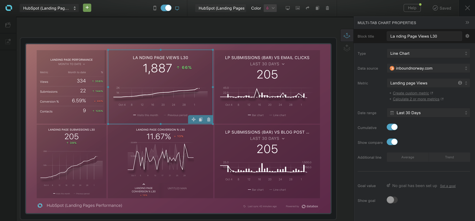
This is what it looks like in Databox when you’re working with a dashboard. In the menu on the right, you choose which type of visual representation you want (the one marked here is a "line chart").
Additionally, choose where Databox will extract the numbers from (here you can choose from all the sources you have linked to Databox, such as Facebook, Google Analytics, AdWords, MailChimp and HubSpot), which parameters you want to measure, and what time periods you want to measure.
With Databox we can thus easily report on statistics we could never create without this system, while spending time analyzing the numbers rather than retrieving them from all the different systems.
This is How We Use Databox
Databox gives you a lot of options to personalise and customise – which is perfect for agencies who want a better perception of what their investment in marketing actually results in, and for agencies that take care of different businesses' marketing.
These are some of the ways in which Inbound Norway uses Databox and which benefits it gives us as an agency:
1) We make dashboards from scratch depending on what numbers our customers want to measure ROI on
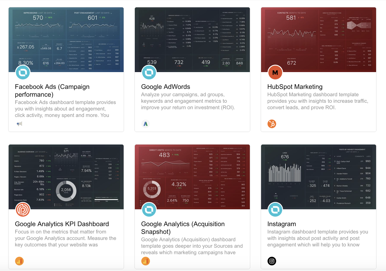
This is an invaluable opportunity when you work with several different customers who want to measure the success of marketing campaigns in different ways. With Databox, you can build dashboards from scratch, or you can download one from the templates library and then customise as you wish.
Here you can sort out if you only want to see those who give you insights on your Facebook ads, AdWords, Analytics, Instagram, or others. What we like about Databox is that you don’t have to create a dashboard for each source.
You can, for example, create a dashboard that retrieves information from both Facebook, Twitter and Instagram if you want to compare different social media against each other.
2) We create a separate dashboard that illustrates how well our content converts
This dashboard is made solely based on data from HubSpot. On the top left, you can see the number of contacts as well as the percentage increase over the previous period.
We have also created a funnel that illustrates our customers entire sales journey all the way from when they visit the site until they become leads, MQL (Marketing Qualified Lead), SQL (Sales Qualified Lead), and finally, a customer.
This gives us a good insight into where we need to add resources. For example, you can see that our conversion rate from visits to leads (contact) are above average.
Moreover, we have a relatively high conversion rate from lead to MQL, but low conversion rate from MQL to SQL. This is therefore where we’ll need to add more resources to achieve the goal: more customers.
Below you can see the so-called "progress bar" – an overview of how close we are to reaching the goal we have set for number of leads. This gives us a simple overview of where we stand this week or month on reaching this goal.
You can also set up a notification to let you know if it’s unlikely that you’ll reach the monthly goal so that you immediately can take more action.
3) We create custom dashboards tailored to our sellers
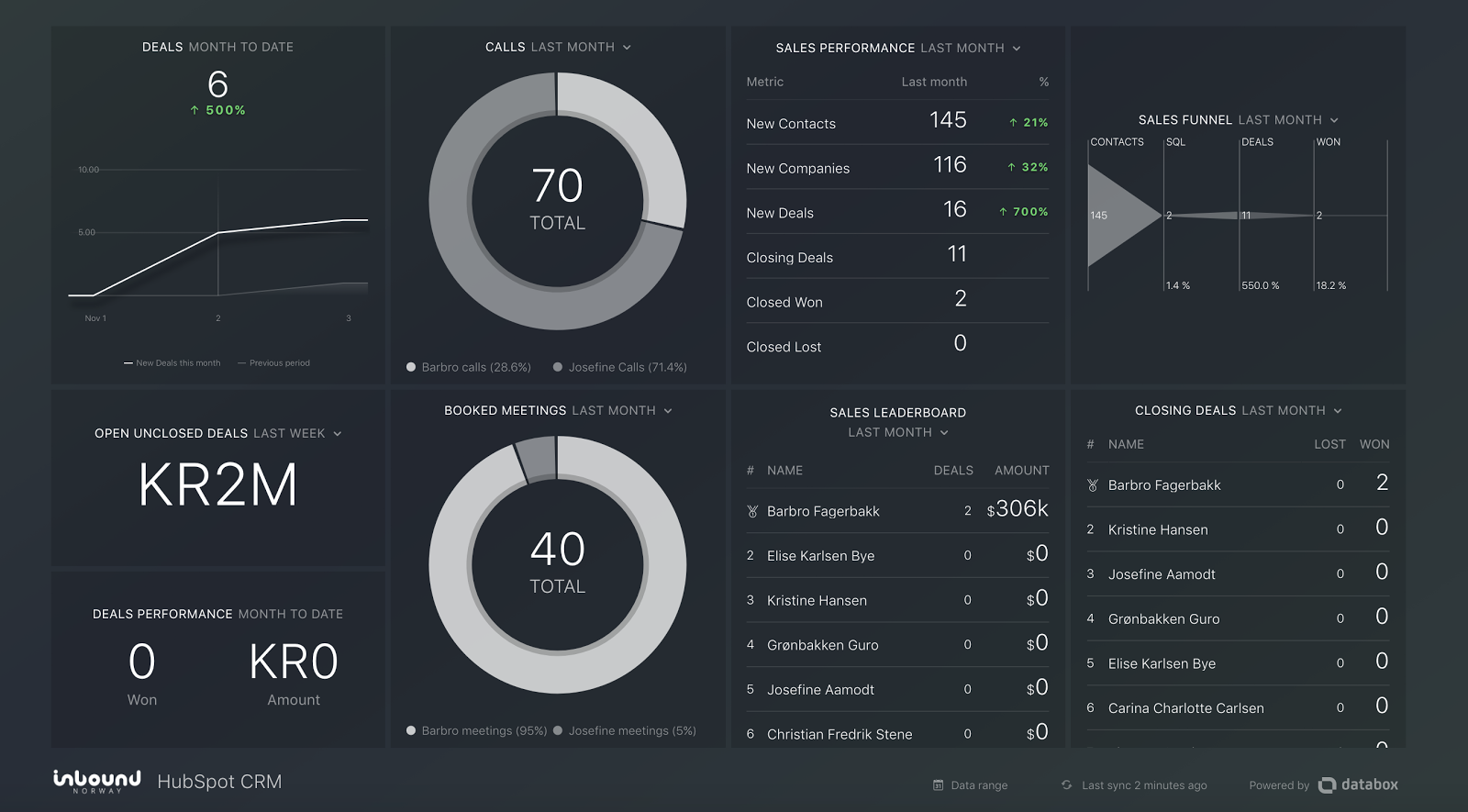
A salesperson and a marketer are not necessarily measured on the same KPIs, so why should they have the same dashboard? We have created a separate overview for our salespeople including the most important parameters for them: How many deals are in the pipeline?
When do the salespeople meet their goals for the number of phones and booked meetings? Do they get enough sales-qualified leads from the market team? How many deals do they win and how many do they have open?
In summary, you can use Databox to customize various dashboards to meet different needs and gather all statistics for your marketing activities in one place, so that you can easily get an overview of whether or not you’re reaching the goals you’ve set and how much you actually get back for the money you invest in your marketing.
It doesn’t get more simple nor effective than this.
Need help with your marketing? We're more than happy to have a chat about how we together can skyrocket your company. Get in touch by clicking the button below.


