For any chatbot to be a success, it needs to aid the overall user experience. If it’s helpful, easy to navigate and your users get value from it, then great, you’re on the right track. But you also want your chatbot user interface (UI) to look so impressive that you can’t help but admire your handiwork.
In the age of Gen AI, the most “beautiful” conversational experiences aren’t chat windows, though. They’re AI customer agents that resolve issues, qualify buyers and hand off cleanly to humans. This guide now shows what changed with the release of AI Agents, how HubSpot’s Customer Agent actually works and how to launch one that’s on‑brand, measurable, and safe.
Also, to be clear, having a beautiful UI isn't enough for your chatbot or answer agent. It also has to provide helpful answers — fast.
Reminder: What is a chatbot?
To a developer, a chatbot is a mixture of a bunch of technical jargon that you and I will nod our heads in complete ignorance at. To most people, chatbots are communication tools that emulate conversation through an interface of pre-written responses. Answers are given based on the customer’s previous message or query, analysing for phrases and keywords related to issues and solutions common to the industry.
But what can set a chatbot apart, making it incredibly user-friendly and memorable, is the user interface. Whether you’re suffering from designer’s block, you can’t finalise a UI design or you want to see some amazing examples, here are some beautiful designs that will inspire you.
- Immersive video experiences
- Chatlio’s simple design and bold colours
- Animated chat from Jakub Antilak
- Less is more: HubSpot’s very own HubBot
- Customisable chat: Direct Message by Hummingbirdsday
- A multitasking messenger user interface
- Replika: The human-sounding chatbot
- The chatbot for a smart home
- Milo, the amusing chatbot for building websites
- Erica, the data-visualising chatbot
- The next level for appointment booking
- A very welcoming welcome screen
And then, going beyond the front-end UI, we have an exploration of how to build an AI Agent that can act as your next-level chatbot.
Jump to: Behind the UI: How a Customer Agent Works or How to Install HubSpot Customer Agent (step by step)
Context on the evolution of chatbots: From rule-based FAQs to autonomous AI agents
Chatbot vs Agent: 20-second explainer
- Chatbots follow scripts and menus. They’re fine for simple FAQs but falter on nuance or when the conversation shifts.
- Customer agents understand context, answer with cited sources from your approved content, take actions (e.g. check an order status) and escalate to humans based on confidence levels, and chat across different channels.
Bottom line: “Beautiful,” in the agent era, means coverage, correctness and control. Not just gradients and bubbles - but they are still part of the puzzle.
For years, the gold standard for a successful chatbot was a clean user interface and a smooth user experience. If it looked good and answered basic questions, you were on the right track. They used an "if this then that" kind of logic.
But the conversation has evolved from "chatbots" to "AI Agents."
We're moving beyond simple, pre-written responses and keyword triggers. Today's most effective tools are intelligent, autonomous agents that don't just answer questions; they also take action. They learn by integrating with other business tools and can solve more complex problems than a pre-scripted chatbot can.
In this updated post, we'll explore the timeless design principles that still matter, but more importantly, we'll dive deep into the new direction of chatbots and agents, focusing on how HubSpot's Customer Agent works and how it's revolutionising the way businesses connect with their customers.
How is an AI agent different from a chatbot?
An AI agent, like the new HubSpot Customer Agent, is fundamentally different. It's powered by a Large Language Model (LLM) and built on a framework that allows it to:
- Understand intent and context: It doesn't just look for keywords; it understands the nuance and intent behind a user's query, no matter how they phrase it.
- Access knowledge: It securely connects to your knowledge base, website content and internal documentation to provide accurate, context-aware answers.
- Use tools: This is the game-changer. An AI agent can integrate with your core business systems. It can book a meeting in a sales rep's calendar, create a support ticket in your service desk or update a contact record in your CRM. It does things.
- Learn and improve: It learns from every interaction to become more effective over time, identifying gaps in your knowledge base and optimising its responses.
While a beautiful user interface is still crucial for a great experience, the true power of a modern agent lies in its intelligence and autonomy.
Beautiful chatbot UI examples to inspire your AI agent design
1. Immersive video experiences
To captivate users with strong colours and exciting video use, designer Dmitry Seryukov of Red Mad Robot found a unique way to add and expand a video. He also incorporated a trendy colour scheme in this chatbot example.
The creative aspect here sees a unique way to expand a shared video. This is done by extending the video gradually from the mobile device’s corner to the full screen, instantly grabbing the user's attention. What’s even better is he hasn’t gone overboard with the colour scheme.
 Credit: Dribbble
You can never go wrong with classic black and white. This is something users are likely to feel comfortable with as it offers a peaceful and serene finish. One lesson to take away from this example is to keep your colours on brand and pick the perfect scheme for your designs.
Couple this with beautiful animations and transitions and you’re onto a winner.
2. Chatlio’s simple design and bold colours
With a comfortable colour scheme and conversation bubbles, the Balkan Brothers took on this chatbot UI project and nailed it. They implemented a uniform theme colour and rounded the corners of the conversation bubbles to create a fresh, sleek look.
You’ll notice just how simple it is. They haven’t gone too crazy with the design, plus it’s nice to look at and feels inviting. Sometimes, simple is better as these layouts are good for users who want an easier and more pleasant experience.
-1.gif?width=600&name=ezgif_com-optimize%20(1)-1.gif) Credit: Dribbble
Credit: Dribbble
Make sure to look at the finer details, too. Look at the example above and notice the super-subtle animation on the thumbs-up and thumbs-down, which will undoubtedly increase feedback numbers.
Another thing they’ve nailed is the choice of a clean and clear font. With all that’s going on, keep the readability as clear as you can.
3. Animated chat from Jakub Antilak
Jakub Antalik’s Chat Animation UI is a perfect example of showing how aesthetically pleasing chatbots can be. Although you might not be an animation whizz right now, it’s good to know what you can achieve down the line.
In this example, the most distinctive feature is the special fluid effect when the messages are sent.
-1.gif?width=600&name=ezgif_com-optimize%20(2)-1.gif) Credit: Dribbble
Credit: Dribbble
The messages don’t randomly pop up in the conversation. It’s a bubble-effect that detaches itself from where the messages are typed before floating away into the conversation. This is a great animation because you can’t help but look at the message as it floats away.
While it’s a tiny inclusion, it’s a lot better than some of the tedious and static options out there. This is still engaging enough to make you want to send multiple messages to see the animation’s fluidity.
It’s a simple effect, yet unique. Small details like these can make all the difference when separating a pretty good chatbot UI from a memorable one.
4. Less is more: HubSpot’s very own HubBot (Customer Agent)
This AI Agent chatbot by HubSpot has more to offer users than just a clever name.
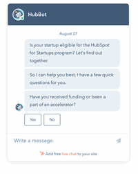 Credit: HubSpot
Another example that shows simplicity is often the best route is HubSpot’s chatbot — HubBot. This chatbot books meetings, creates self-service support articles and integrates with a ticketing system. It’s the perfect tool for businesses as it connects with HubSpot’s marketing, sales and service hubs.
From a design point of view, it keeps things simple. A clear, easy-to-read font, plenty of consistent white space throughout the chat and the unique conversational tone used to create a winning combo. This will give you the perfect example to use as inspiration for your own chatbot. No clutter whatsoever.
This is because it's putting the output of some very sophisticated technology behind the scenes front and centre. Check out what's going on behind the simple UI further down this post.

5. Customisable chat: Direct Message by Hummingbirdsday
The Direct Message UI by designer Hummingbirdsday might look simple (which is great), but it does feature a very personal and interesting graffiti board. That’s not something you see in many chatbots.
The customisation aspect is a valuable feature, where users can change the colour of the text within the messages they send.
-1.gif?width=600&name=ezgif_com-optimize%20(4)-1.gif) Credit: Dribbble
Credit: Dribbble
The interesting and intuitive graffiti board is a beneficial addition here. What’s unique about this example is that the feature is uncommon. If anything, it’ll encourage the users to test it out and play with its functionality.
This is an excellent way of boosting engagement and is likely to lead to more customers in the end.
6. A multitasking messenger user interface
Probably one of the most beautiful examples on this list, Cuberto’s Multitasking Messenger UI not only demands attention but also keeps it. It’s super-engaging because of the interesting animated background photos.
This includes interesting dynamic effects like video background and animated transitions, making it a lot more attractive.
-1.gif?width=600&name=ezgif_com-optimize%20(5)-1.gif) Credit: Dribbble
Credit: Dribbble
Even when the animated backgrounds aren’t in action, users are treated to a spotless and tidy interface with sleek typography to make it even easier to read.
7. Replika: The human-sounding chatbot
One obvious thing about chatbots is that they’re not always conversational, offering set responses that have been pre-written. This isn’t a drawback, as creating a human-sounding chatbot takes time and effort and isn’t always necessary. However, when it’s done, it’s something special. And this is where Replika shines.
Replika is a contextual chatbot that learns from each conversation it has, even reaching the uncanny point of mimicking the user’s speech. It was created to build and develop digital companions for people, as Replika is a chatbot you can just talk to and, effectively, bond with.
Replika’s ability to hold a conversation is the key driver of this impressive UI. It’s the content, not the design, that sets it apart from other chatbots.
This is one thing to remember when developing a chatbot: It’s not necessarily just about how it looks but also what it says and how it says it. Replika’s personalisation helps to create a chatbot you want to return to time and time again.
8. The chatbot for a smart home
Valentin Salmon’s advanced bot is something to behold. Away from the fact that it provides timely and relevant responses, this personal assistant-style chatbot is one of the tidiest UI examples you’ll encounter.
-1.gif?width=600&name=ezgif_com-optimize%20(6)-1.gif) Credit: Dribbble
Credit: Dribbble
What’s not to love? The animations are subtle yet engaging, the colours are simple yet clear and the font is basic but perfect for easy reading.
9. Milo, the amusing chatbot for building websites
Milo is another example of where written content has been the focus in the design and development stage. The conversation is fairly limited, but Milo’s responses are amusing and make marketing and website redesign seem a lot less serious than they usually are. The script is light and entertaining, making you actively want to pursue talking to it.
GIFs and images are used to create a pretty realistic tone for Milo, adding the kind of humour only humans understand.
10. Erica, the data-visualising chatbot
Banking isn’t the most entertaining task in the world, but Erica, the chatbot used by the Bank of America, works to correct that.
First of all, users can make text or voice commands to check on things related to their bank account, which is pretty handy. However, Erica’s most useful feature is its ability to present graphs and images to communicate information about your finances.
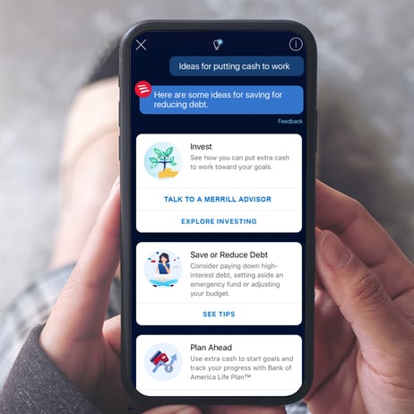
Credit: Bank of America
This means you can see just how much you’ve spent on coffee and snacks every month.
11. The next level for appointment booking
The beauty of this example, designed by Sơn Min, is in its simplicity and functionality. Although other designs in this list may be more engaging, usability is key for chatbots.
Credit: Dribble
This appointment booking example is clean and uncluttered, allowing the main purpose of the bot and its clever execution to truly shine. The visual icons that pop up from the side allow users to quickly let the bot know how it can assist, with automated options to complete the message with a few swipes and clicks.
This saves users time and effort in having to type out their own full message.
12. A very welcoming welcome screen
This example from Vlad Tyzum effectively shows how you can use the interface to capture user attention before the conversation even begins. What’s instantly recognisable here are the charming and animated expressions before the chat can start.
-1.gif?width=600&name=ezgif_com-optimize%20(7)-1.gif)
The UI of this chatbot is so special that it creates an emotional connection with users right from the start. It screams positivity, which can improve a user’s experience before the conversation even begins.
These are just some examples out there. But if you remember only one thing after leaving here, it should be the simplicity factor. Sure, animations and various colours are pretty cool, but none of them go overboard.
Keep it simple so users stay engaged and don't lose focus on all your good work.
Although there’s a little more to consider when adopting conversational marketing, the UI is just one small aspect. To help with that, we’ve created a playbook to make your journey to chatbot implementation one big success.
Behind the UI: How HubSpot Customer Agent works
Moving from theory to practice, the perfect example of a modern AI Agent is HubSpot's Customer Agent. Unveiled at INBOUND 25, it represents a complete shift from the old HubBot chatbot to a fully-fledged, AI-powered team member.
It’s more than just a chat window with prescribed options and journeys. It's a more natural and organic conversation, but still based on reliable facts and source materials.
HubSpot’s Customer Agent uses your approved content (knowledge base, webpages, files and even selected public URLs) to answer customer questions with cited sources and a tone that matches your brand. You can deploy it to website chat, WhatsApp, Facebook Messenger, email and voice, then define exactly when it should hand off to a human.
For tasks beyond Q&A, give it Actions: secure, API‑based steps like check order status or reset password. Your team can test responses upfront, see which sources and triggers were used via Message Insights and iterate quickly as you spot knowledge gaps. It runs on HubSpot Credits (included with Pro+ tiers), and you can monitor trends like resolution and containment to prove ROI.
Here’s how it does it:
1. It's grounded in your approved business knowledge
The agent starts by connecting to your sources of truth. You can feed it your website pages, knowledge base articles and product documentation. This process, known as Retrieval-Augmented Generation (RAG), ensures the agent's answers are always based on your specific business information, preventing inaccuracies and "hallucinations."2. It's integrated with your HubSpot platform
This is its superpower. Because it lives within HubSpot, the Customer Agent can take actions across Marketing, Sales and Service Hubs.-
- For Sales: It can qualify leads based on your criteria, book meetings directly on a sales rep's calendar and create new contact records with conversation details automatically logged.
- For Service: It can understand a customer's issue, provide instant solutions from the knowledge base, create a support ticket with the correct priority level and route it to the right human agent if the issue is too complex. What I like is that these interactions can work with the Knowledge Base Agent to take escalated-to-human answers and draft Knowledge Base articles that inform future Customer Agent chats.
- For Marketing: It can recommend relevant blog posts, register users for webinars and add contacts to specific marketing workflows based on their expressed interests.
3. It knows when to turn to a human
No agent can solve 100% of queries. HubSpot's Customer Agent is designed to recognise its own limits. When a conversation requires human empathy, complex negotiation or security verification, it seamlessly transfers the entire chat history and context to a live agent, ensuring the customer never has to repeat themselves.
4. A clear and beautiful UI
While the backend is complex, the user-facing UI is clean and functional. It uses simple prompts, buttons and tools like calendar pickers to make it easy for the user to provide information and achieve their goals quickly. It prioritises function over flair, ensuring the path to a solution is always the top priority.
HubSpot's Customer Agent isn't just a "beautiful" chatbot. It's a hardworking, efficient and intelligent tool designed to drive real business outcomes. Here's how to install it and some things to consider.
How to install HubSpot’s Customer Agent (step‑by‑step)
Understand credits & conversation closure settingsCustomer Agent runs on HubSpot Credits; conversations auto‑close after inactivity (24h for chat/WhatsApp/Facebook/voice; 72h for email). These things need mapping in advance to make sure you have the correct credits and settings in your account for your budget and use case.
1. Set the right governance and guardrails
-
- Sources: keep to approved KB and pages; weekly resync or on‑change sync for KB. Add short answers for must‑say topics.
- Handoff: define words/phrases that must escalate (refund, legal, cancellation, outage).
- Compliance: avoid sensitive data in training inputs; monitor credits and set pause rules during updates.
2. Point it at the right knowledge
Connect approved sources (KB articles, website/landing pages, blogs, files) and optional public URLs. You can bulk‑import related URLs and add short answers for pinned replies. Toggle citations on/off per source.
3. Align tone and governance
Pick a personality (friendly/professional/casual/empathetic/witty) or use your configured brand voice so answers stay on‑brand. The agent detects browser language and responds accordingly.
4. Deploy to channels
Assign once, cover many chat points: Website live chat, WhatsApp, Facebook Messenger, email and voice; custom channels available in beta. Set explicit handoff logic (who gets what, when) and triggers (e.g., “refund”, “cancel”).
5. Teach it to do things (Actions)
Define actions that call external apps/APIs (the agent can make API calls (GET or POST) to another system, with authentication) to handle tasks like check order status or reset passwords. Set trigger phrases and required inputs; preview and publish.
6. Test, monitor, improve
Use the built‑in test features and Message Insights to see triggers, sources and reasoning. Track performance, fill knowledge gaps and iterate. (Enterprise adds audit logs.)
Proof it works: HubSpot data shows Customer Agent resolves 50% of support tickets and ~40% less time is spent closing tickets. This is best achieved with the new Knowledge Base Agent, which fills content gaps that the Customer Agent detects.
If you saw talk of the Loop playbook at INBOUND 25, this is it in action. Self-improving cycle of the Knowledge Base Agent crafting articles based on human answers to queries Customer Agent couldn't answer so that Customer Agent can answer them in future conversations.
The future of customer support and knowledge base production is here.
Are you ready to activate it for your company?
Get your Agent trained and live by an expert team
Design, train and launch your Customer Agent in just 2-3 weeks from now. Including a knowledge audit, establishing your brand voice, creating actions (order status/reset password) and turning on a multi‑channel deployment with clear analytics and governance in place. Get started via this page and a first call to discuss your goals.
HubSpot Customer Agent FAQs
Which channels does Customer Agent support?
Live chat, WhatsApp, Facebook Messenger, email and voice (Calling in beta). Custom channel deployment is also available in beta.
Can it take actions, not just answer?
Yes. Define Actions that call your APIs with GET/POST and authentication to retrieve/update data (e.g., ticket creation, booking, order status).
How quickly can we set this up?
It takes minutes for a very basic MVP: point to sources, set voice, assign channels, add handoff triggers and ship two Actions. For something more effective, it's more like a solid few days' work of knowledge curation and Agent training.
How is it priced (as a tool)?
Included with Professional/Enterprise HubSpot subscriptions; but usage draws on HubSpot Credits (expandable and needs pre-management). There's no "out the box" costing as it all depends on your product tier and estimated usage needs.
What about content gaps?
The most efficient way to plug gaps is to pair Customer Agent with Knowledge Base Agent. Customer Agent surfaces gaps; Knowledge Base Agent drafts articles to fill them and you approve/tweak them and publish — creating a continuous improvement loop.


