Having explored our golden call to action (CTA) rules in an earlier blog post, it’s time to see what these fundamentals look like in practice. From market-leading B2B firms to innovative B2C companies, we dissect every element of their successful CTAs including popular accounting software, Xero and luxury destination, Selfridges.
1. Grammarly

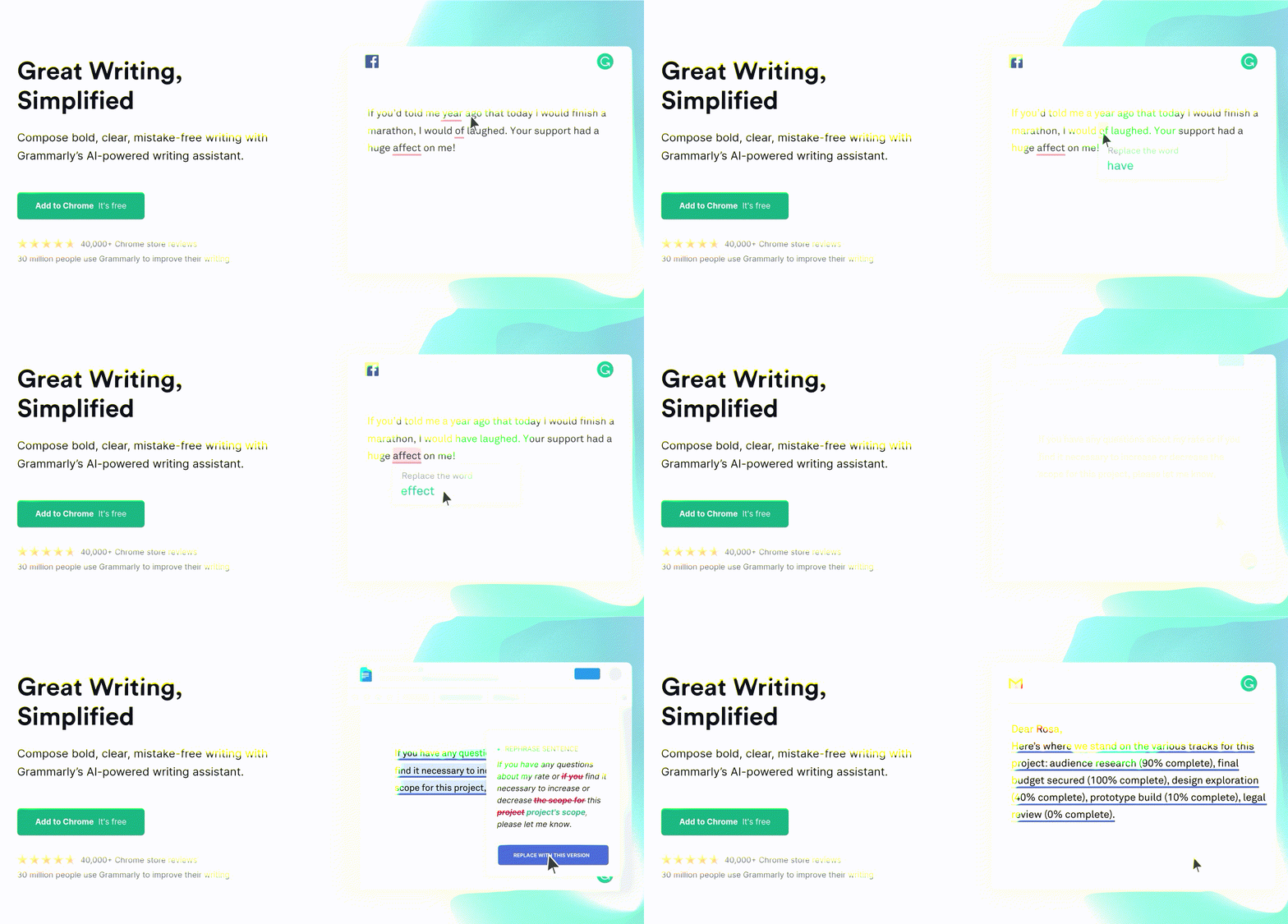
Since Grammarly is free (with the option to upgrade to Grammarly premium), the brand is laser-focused on urging users to do one key thing: use Grammarly, preferably by adding the software as an extension to your browser.
Why it works
- Compelling copy: Grammarly’s copy is reflective of its brand. It’s clean, clear and without error, making it the simplest way to say ‘try us’ without leaving out any of the good stuff. In one sentence, it states its proposition and drops mention of its AI-powered writing assistant
- Inclusive offer: Careful not to leave out those who learn via visuals, the adjacent on-screen demo shows rather than tells, displaying the functions of Grammarly and its ease of use
- No-barrier CTA button: The CTA button encourages the reader to ‘Add to Chrome’ before reminding us the action is free. For any company, a CTA without a cost barrier creates an instantly attractive offer
- Social proof: Just in case a visitor remains on the fence, Grammarly includes two forms of social proof revealing how many people use Grammarly, as well as its Chrome store reviews
- One route: Unlike other homepage CTAs, there aren’t multiple options for a user to explore. And while this can sometimes alienate users who aren’t aligned with a certain action, in this case, we think the singular option is pretty universal
When to use it
The individual components of this CTA work in many different scenarios. After all, adding social proof to a CTA is rarely a bad idea. However, the exact format of this CTA - complete with video demo - is best suited to software and technical applications where visitors are concerned about usability and functionality, above cost and appearance.
2. HUBBLE

One of the first to take contact lenses online, HUBBLE attempts to hook users in with a small change sample purchase. Working in a similar way to most streaming services, HUBBLE’s primary CTA ‘Get £1 Box’ adopts the theory that most customers continue as lifelong subscribers once they enjoy an initial low-cost experience, before becoming an advocate of your brand.
Why it works
- Familiar format, new industry: HUBBLE takes the well-known free trial to subscription format and introduces it to optometry. This makes an old favourite feel exciting, persuading people to ditch trips to the opticians in favour of letterbox delivery
- Price promise: Knowing contact lenses are a boring but necessary purchase, HUBBLE attracts users with a financial incentive, testing a two-week supply for £1. This low price appears twice in HUBBLE’s CTA, once in the copy and again in the button hammering home the true appeal of this deal
- Quick customisation: Customers need contact lenses that are specific to their prescription. A short quiz implies that they can fulfil this need quickly and efficiently. Do most users plan on picking up contact lenses over the internet? Probably not. But HUBBLE makes the switch seem short and simple, balancing the importance of individuality with the excitement of an impulse purchase. In turn, visitors with no intention of switching to an online subscription suddenly consider the offer and accept a short-term trial
- Attractive image: HUBBLE’s branding is fun, fresh and daringly modern (at least by optician’s standards). None of HUBBLE’s tactics are entirely original but what matters is they’re innovative for their industry. This alone makes HUBBLE’s CTA intriguing at the very least
When to use it
Clearly, there are no defined rules for assuming a subscription format. Sure, some industries are more at ease than others with month-to-month payments. Yet, new entrants like HUBBLE can benefit from this format feeling foreign and therefore exciting to its audience. If your customer craves convenience and a lower or more predictable price point, offering subscription services may also pay off for you.
3. Lush

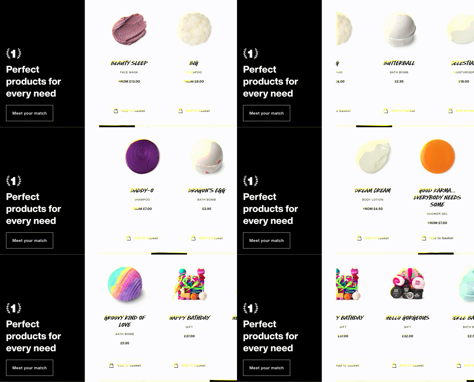
As a big player in the natural beauty game, Lush needs to sell units of soap, shampoo and shower gels while informing their customers about a product’s ingredients, uses, ethics and benefits. Similar to any eCommerce store, Lush needs to action visitors to buy but this established brand is known for playing around with CTA text to give ‘Shop now’ or ‘Buy this’ a feel-good, small-shop feel.
Why it works
- Simple CTA, several choices: In this secondary homepage CTA, Lush pairs simplicity with selection. Here, a three-word CTA turns into a library of Lush products making every customer feel catered for
- Unique interaction: Purchasers are programmed to click a CTA button, until suddenly they’re not. For those bored of clicking flashy, bright-coloured commands, Lush offers a new alternative - the ability to scroll to create action.
- One-click purchase: Users don’t need to visit a chain of service pages to get what they need. With an ‘Add to Basket’ option underneath every product, visitors are empowered to make impulse purchases that are facilitated by five-star system ratings
- No need to say ‘pay’: For an eCommerce CTA, there’s little mention of money involved. The phrase ‘Meet your match’ makes buying a shampoo or body lotion feel more like finding a soulmate than finding a new favourite product. In turn, it makes the notion of making a purchase all that much more appealing as it's left up to the customer to decide, completely free from any sales pressure
When to use it
Both the format and feel of this CTA lend themselves to eCommerce businesses. However, even if your business doesn’t sell products, you can take something away from this intelligent marketing effort. Switching up a customer’s interaction and asking them to scroll is undoubtedly more stimulating than another bold button to click.
So, try it. How can you probe your customer to act without leaving them feeling like a classically conditioned Pavlov’s dog?
4. Xero

Online accounting software provider Xero has the tough task of pushing a complicated, technical product while making a dry subject seem interesting. To do this, a CTA needs to be torn into two offering educational and practical value for any potential customer.
Why it works
- Evoking emotion through colour: If you’re someone that subscribes to colour theory and semiotics, you’ll appreciate Xero’s use of colour in this CTA. Limiting its palette to blue and white, Xero evokes trust, stability and confidence; all things finance managers look for in an accounting system. Plus, Xero’s focus on creating a ‘healthy’ business ties in well with this NHS-like branding
- Fuss-free design: The simplicity of this CTA - the boldness of its text, the readability of its font and the sea of ocean blue it sits upon - helps users to gain clarity and consider Xero’s core message without distraction
- Addresses pain points: Throughout its copy, Xero addresses two major pain points: ease of use and financial health. Without saying much (there are less than 25 words on the CTA page in total), this CTA has an immediate impact, speaking directly to its customer’s deepest desires and frustrations
- Split CTA choice: Unlike other case studies on this page, Xero offers up a fork in the road, giving users two actions to choose from. In doing this, the CTA nurtures both visitors in the consideration and decision stages of the buyer’s journey. Those considering accounting software may choose the left-hand button ‘Learn what Xero can do’ while ‘Plans from £10 per month’ speaks to those much further down the funnel who are ready to pay today
When to use it
As a B2B business, Xero has cracked the code for commercial CTAs where messaging needs to be professional and to the point. From its clean design to its actionable copy, this CTA could easily become a ready-to-use template for any B2B business. However, there are elements from this that any marketer can take, including its clever use of colour.
5. Selfridges

As a luxury eCommerce website, Selfridges has all of the usual product-selling responsibilities, with a twist. The high-end department store needs to entice discerning buyers who are heavily reliant on research and superior service to make purchasing decisions.
Why it works
- In-depth awareness of buyer persona: A somewhat controversial eCommerce homepage banner, this CTA shows bravery and brains on Selfridges part. Knowing their affluent customer base well, Selfridges helps bring the meaty research step of this buyer’s journey to the customer, all the while keeping them on their website
- It screams Selfridges: This CTA is so on-brand it hurts. It’s elaborate, custom-made and has superior customer service as its core
- Cleverly blends content with eCommerce: Adopting an inbound marketing approach, the luxury department store is adding value to the shopping experience through effective storytelling to entertain and build brand affinity. From the purpose-drawn graphics to the millennial angled copy, this clever piece of content marketing aligns its products with the right people
- Simulates in-store experience: For most people, a high-fashion purchase is anything but impulse with most customers preferring to visit a store than spend a significant amount of money online. The ability to touch and feel fabrics, consult sales experts and hire personal shoppers all make the in-store Selfridges experience more desirable. Still, with this CTA, Selfridges helps to simulate at least part of the physical buyer’s journey by providing content to act as a personal shopping service, referring customers to the right type of products for them
When to use it
Driving sales through helpful content isn’t a groundbreaking idea. In fact, this is pretty much the definition of inbound marketing. However, placing a content-driven message in place of a more direct, commercial CTA isn’t right for every business. It works for brands that pride themselves on superior service and those that notice an extended consideration stage before their ideal customer comes to a decision.
Focus on information, education and entertainment--not just action
The ability to craft killer CTAs is an undoubtedly desirable skill, one that helps to shrink bounce rates and foster sales. Yet, master marketers are capable of so much more, being able to stage an entire inbound marketing campaign.
Attractive offers and irresistible banner buttons aside, talented content creators spend time creating detail-rich buyer personas, harnessing in-depth intel on the buyer’s journey and conducting thorough content audits. These activities ensure that visitors enjoy the content they encounter, in turn, making them more receptive to CTAs.
When we help, educate, inform and entertain users, they’re happier to take action, with a gentle nudge being all that’s needed to coax them to convert. To master more than just action-oriented content, download our inbound template pack.
Your call to actions will benefit, as will the informational and educational content you produce. Get access to the templates using the button below.


