Generation Y-ers, or millennials, grew up alongside the internet. It was a novelty in their youth and they learned how to use it at the same time the internet worked out exactly how it wanted to be used. They were both on a coming-of-age, journey of discovery together, if you will.

Whereas the next generation of users has been born with e-commerce and social media as a norm, millennials want excellent website navigation because they come from an earlier time and overcame - and were brought up by a generation who instilled a level of - scepticity to the internet. Your site needs to gain and maintain trust. It's the online face of your business - not just simply another normal angle business, like it is for Generation Z who don't see any issue with spending online.
Here's how you can improve your site to entice millennials who love to browse the web incessantly into converting into leads. It's all about using improved navigation to improve UX.
1. Provide A Consistent Horizontal Nav Bar
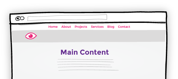
First things first; you need a permanent horizontal navigation bar at the top of your pages. This'll act as an anchor point, giving users a sense of orientation on your site. This will instill a comfortable feeling, reducing bounce rate and working to help increase the likelihood they will move through the funnel into a conversion.

2. Keep Your Navigation Logical
Don't look to re-invent the wheel when it comes to site navigation. Sure, experiment and push the boundaries with your content and social interactions, if that's your brand's style; but your navigation should be a professional, logical, sanctity of stability on your site. Especially if you are trying to entice users into spending their time or cash with you.
No matter how quaint and twee your product's copy may be, your page titles, meta and navigation links should clear and concise.
This will also help with your SEO.
3. Don't Let Them Hit Back
No, not like that. Have an explore around your own site and invite as many as people as you can badger into helping do the same. If at any point you/they need to hit the browser's "back" button, your site navigation can stand to be improved on that page.
This creates a flowing essence to your UX and leaves users feeling like they're in good hands. Building trust.
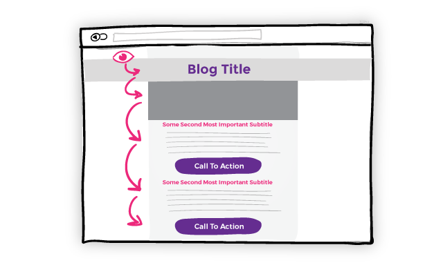
Include internal links mid-way and at the end of blog posts, for example. Have a handy link back to the page that brought a user to the page they're currently seeing or at least back to the Parent of said page. 
4. Play By The Rules
Similar to points 1 & 2 but worth reiterating; play by as many of the accepted norms as possible.
At some point, every single person who visits your site is doing so for the first time. They need to have some sort of "industry norm" in place to be able to follow their nose around your site and get what they need.
Navigation along the top or (if you have to) on the left. Keep the small-print and T&Cs on a secondary link or in the footer. Rank your page links, in your navigation, in descending importance from left to right and put contact info furthest right.
People know what they like and like what they know.
5. You MUST Be Mobile Friendly
As covered by everybody on the internet, Google now prioritises sites which are mobile friendly. This isn't for their benefit but for that of the users; the majority of which now search and browse on a mobile device.
Think carefully about using drop down menus - they are often made ineffective on a mobile device as too many nested pages makes for clumsy UX on a small screen. You might need to utilise Parent Pages instead of Nav Links; you can then take users to a full which shows the nested pages in a more presentable fashion.
It should go without saying, but for heaven's sake make sure any drop down menus or links are mobile optimised. Have you ever tried double-clicking or hovering over a menu on a mobile device? Bounce.
6. Be Efficient With The Amount Of Navigation Options
This falls back to staying logical. Putting every single page onto the navigation bar isn't a good idea.
Try to guide users around your site by planning where a user might want to be head next given the information on their current page. You can then offer links within the content or via images on the page, instead of presenting them with all (or nearly all) the options at once.
7. Make Sure You're Fast
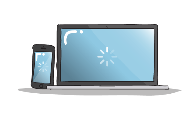
Mobile users often abandon a site when it takes 4 seconds to load. Not long is it? But it's one experience pitfall millennial users hate; waiting.
Scale back the size of images and graphic button CTAs and always make sure they're accompanied by a standard text link. That way, the process can be sped up, even if the image-button isn't loaded yet, the caption link will show users what it is and they can carry on navigating. Similarly, always include Alt Text too.

8. Monitor Behaviour And React Accordingly
Knowledge is key. Make sure you routinely examine user behaviour on your site. Reorganise and rework pages which are getting by passed or don't lead to any contacts or conversions, and also tinker with your navigation to manipulate users into heading to the pages you want them to visit more regularly.
Another great tool for this is heat maps; use them to see where users click and which navigation tools they actually do and don't use. Tweak to suit once you've read more here.
9. Offer a working search tool
If a user is resorting to searching your site, your navigation isn't really efficient enough, but let's park that for now. If you're going to offer a search tool, make sure it works for your user. And when it doesn't - make sure it works for you; instead of "Sorry - no products found", try offering similar products or contact forms. Always provide a solution, even if it isn't the one they originally wanted.

10. Be Consistent
Knowledge is key. Make sure you routinely examine user behaviour on your site. Reorganise and rework pages which are getting by passed or don't lead to any contacts or conversions, and also tinker with your navigation to manipulate users into heading to the pages you want them to visit more regularly.
Another great tool for this is heat maps; use them to see where users click and which navigation tools they actually do and don't use. Tweak to suit once you've read more here.


