Optimising landing pages is a MUST if you want a website that naturally converts. One of the easiest ways to lose a potential lead is to not spend any time improving your landing pages. This is a critical point where a visitor decides to become a contact. Out-of-date designs, spelling mistakes, long sign-up forms are just a few ways you can put a person off. This is why optimisation is so important. There are many techniques you can use to optimise landing pages and massively improve conversions, and here they are...

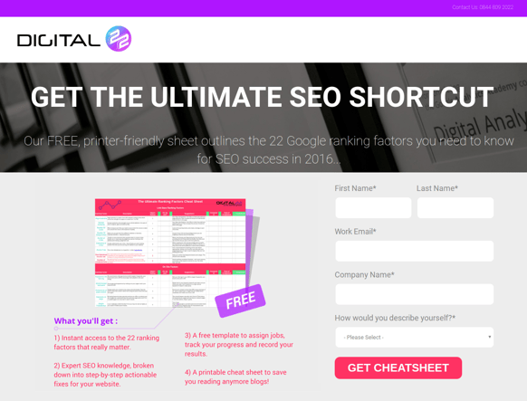
In this blog, I'm going to refer to one of our most successful landing pages as an example: The Digital 22 Ranking Factors Cheat Sheet which currently has a conversion rate of 33.81%.
How to optimise landing pages on your website
1) Focus on your ideal buyer persona
2) Remove the main menu
3) No distractions
4) Quick contact forms
5) Engaging contact form buttons
6) Use actionable content
7) Show the benefits of your download
8) Inspire trust
1) Focus on your ideal buyer persona
Your landing page should engage with your ideal customer. Content, images and available download must be relevant to them.
For example our Ranking Factors Cheat Sheet landing page is created to engage with business owners who want to improve their SEO.
![]()
Content relates to the pain points of our buyer persona
![]()
Image is of the download they will receive
![]() Free cheat sheet download helps improve SEO
Free cheat sheet download helps improve SEO
Each area of the page is relevant to our buyer persona, when they land on this page they will likely be interested by what it has to offer rather than feeling like this page will be of no use to them.
2) Remove The Main Menu
To increase the chance of conversion on your landing pages you have to limit the ways for visitors to leave. Of course, they can easily click the 'back' button but you don't want to be losing potential conversions because they're getting distracted by your navigation menu.
Use a different template for your landing pages. The page design must look the same as the rest of your website pages but it should exclude the navigation menu.
For example: our website page vs. our landing page...
Website

Landing page

In HubSpot, you can choose a design template for your landing pages so it's quick and easy to remove your menu. One of the many benefits of using HubSpot for your inbound strategy.
3) No Distractions
There shouldn't be anything that distracts your buyer persona.
Don't put any ads, banners or any other forms of distractions. Even if they're relevant to your ideal buyer persona, they will distract them from completing the purpose of the landing page.
Save links to your blog and/or shop offers for your Thank You page.
4) Quick Contact Forms
People who land on your landing page, aren't planning to stick around. Here's the honest truth. Even though you've spent hours optimising your landing page to its best potential, most people will spend only 15 seconds on your site.
This is why contact forms should be quick and easy to fill out. There are many reasons why a person can stop filling out a contact form half way through:
- They've changed their mind
- The contact form is too long, and they've got better things to do (it's harsh but true)
- An outside distraction, e.g. the phone rings.
- They've received a social notification (damn, social media!)
Your contact form should ask only for the information you definitely need, like: name and email. It takes less than 15 seconds to submit your name and email address.

If you want to capture more information in your contact forms, whatever you're offering in exchange has to be worth it.
5) Engaging Contact Form Buttons

This is just a sterotypical contact form button. Most businesses use them on their website, so, what's the problem? They're boring and don't engage.
When optimising landing pages, every detail matters.
Research has shown you can get higher conversions from adding a bit more to your buttons.
Rather than "Submit", "Download" or "Register", you should use content that is engaging and relevant to your landing page, for example:
- Start Your Next Step
- Join Our Team
- Stay In Touch
- Enjoy Our Freebies

6) Use Actionable Content
Although your Call-To-Action has prompted an online user to click, you still need actionable content on your landing page to get them to complete the contact form. It's a shame to see people clicking on your CTAs but not becoming new contacts.
On your landing page, you should use content that engages with your ideal buyer persona.
 "Get the Ultimate SEO Shortcut" short, sweet and actionable content.
Your content should encourage them to act now rather than decide to come back later. In this example, saying "ranking factors your need to know for SEO success" will resonate with our target customer.
Having urgency in your content decreases the chance of them getting distracted and instead directs them to make a specific action.
7) Show The Benefits Of Your Download
If you're offering a free valuable download on your landing page then you should highlight what the benefits are for the person downloading it.
Remember, they are exchanging personal contact information so they need to feel like they're getting something valuable and relevant in return.

Showing off the benefits in a clear format
8) Inspire Trust
One of the best ways to optimise your landing page and increase the chance of conversion is to inspire trust.
People don't want to hand over their contact information if they don't feel like your business can be trusted.
Having trust badges and other forms of social proof on your landing page can be a powerful prompt to get people to convert.
For example, below the fold of our Ranking Factors landing page, we shared views from SEO experts we contacted.

Do you want more tips to improve your own marketing? Here's 30...
We've created a guide that shares OVER 30 lesser known marketing tips to help you outsmart your competitors. Our team has shared insider advice on different ways you can improve your strategy and get better results.


